How to Choose Window & Door Colours That Complement Your Home’s Exterior
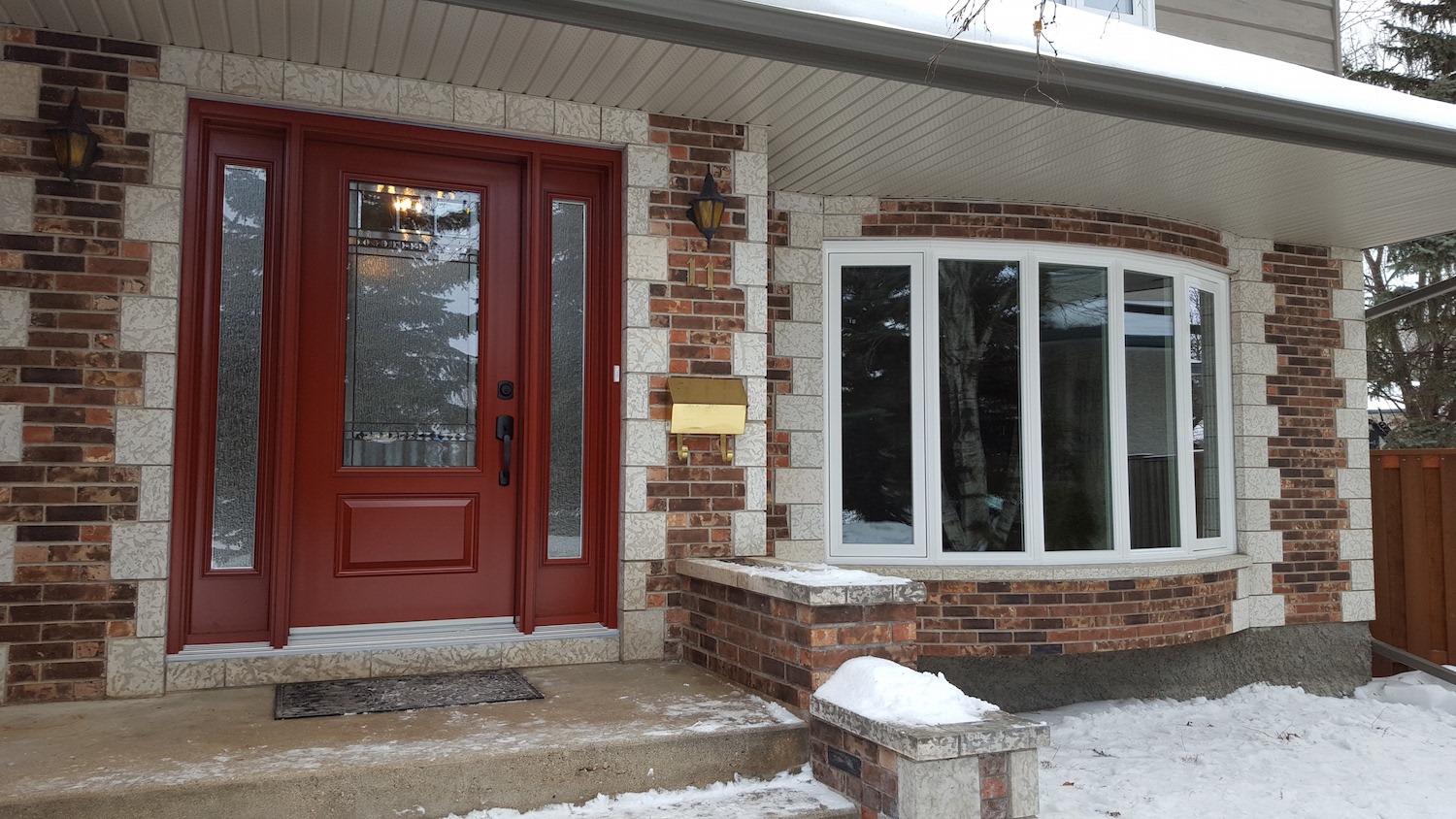
Choosing Window & Door Colours That Complement Your Home
Colour is one of the most powerful tools in house design. The right window colours can lift your home’s exterior from ordinary to striking, improving kerb appeal and visual harmony across the whole property. We help homeowners across York, Selby, and the wider region make colour choices they’ll be proud of for years to come.
Why Colour Choice Matters for Your Home Exterior
First impressions count. A well-chosen front door colour or window frame finish signals quality and care before anyone steps inside. Colour also has a measurable effect on property value. Neutral tones like black, grey, and white consistently attract buyers, while a more considered use of bold colours can set a home apart on any street. The right palette ties together brickwork, roofing, and landscaping into a cohesive whole.
Understanding Your Home’s Style
Looking for windows, doors or conservatory fitters in Yorkshire?
Whether you have specific questions, require more details or want to make a general enquiry, don't hesitate to reach out to our team and we'll be happy to assist you.
Every property has its own character, and colour works best when it reflects that. A modern build calls for a different palette than a Victorian terrace or a rural stone cottage. The architecture of your home is the clearest guide to the colours most likely to work well:
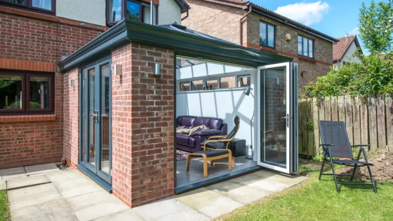
- Modern Homes – Clean, minimal tones suit contemporary properties. Anthracite grey, slate, and crisp white are popular choices for modern windows and doors, offering a sleek, unfussy finish.
- Traditional Properties – Heritage colours work well here. Deep navy, forest green, and classic black all complement period brickwork without disrupting the original character of the building.
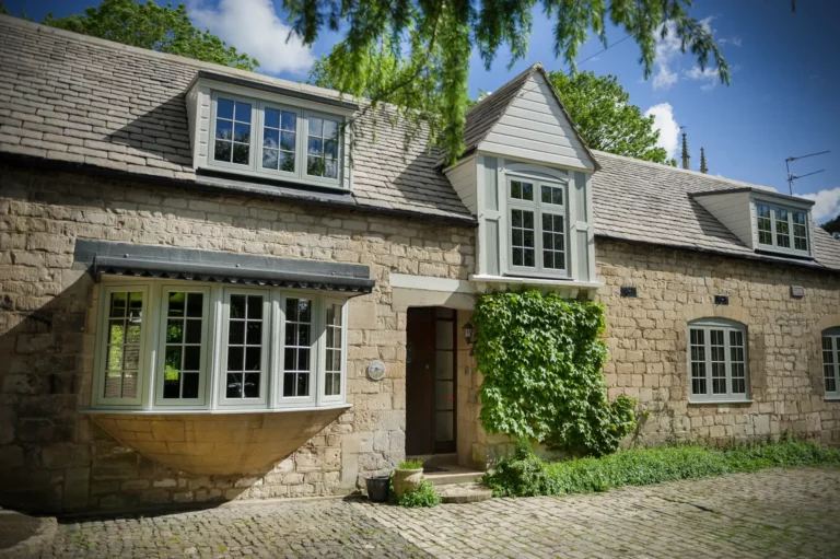
- Rural and Stone Cottages – Earthy, natural tones blend well with stone and timber surroundings. Sage green, warm cream, and soft brown frame a cottage setting without competing with it.
- Rendered Homes – White and light grey frames complement rendered exteriors cleanly. Stronger accent colours on the front door add visual interest without overwhelming the finish.
Popular Window and Door Colour Trends
Colour trends in home exteriors shift over time, but certain choices have proven their staying power. The most popular options tend to balance personal style with broad appeal, making them sound investments for any property:
- Classic Colours – White, black, and grey remain the most widely chosen window and door colours across the UK. These timeless shades suit a wide range of property types and hold their appeal across decades.
- Bold Colours – Navy blue, bottle green, and deep red are strong front door colour choices for homeowners who want a standout entrance. These shades work particularly well on traditional and period homes.
- Natural Finishes – Woodgrain effects and earthy tones have grown steadily in popularity. These finishes bring warmth to the exterior and suit both rural properties and those seeking a softer alternative to painted frames.
Coordinating Colours With Exterior Elements
A colour choice never sits in isolation. Windows and doors interact visually with brickwork, render, roof tiles, and the surrounding landscape. Getting this balance right pulls the whole exterior together:
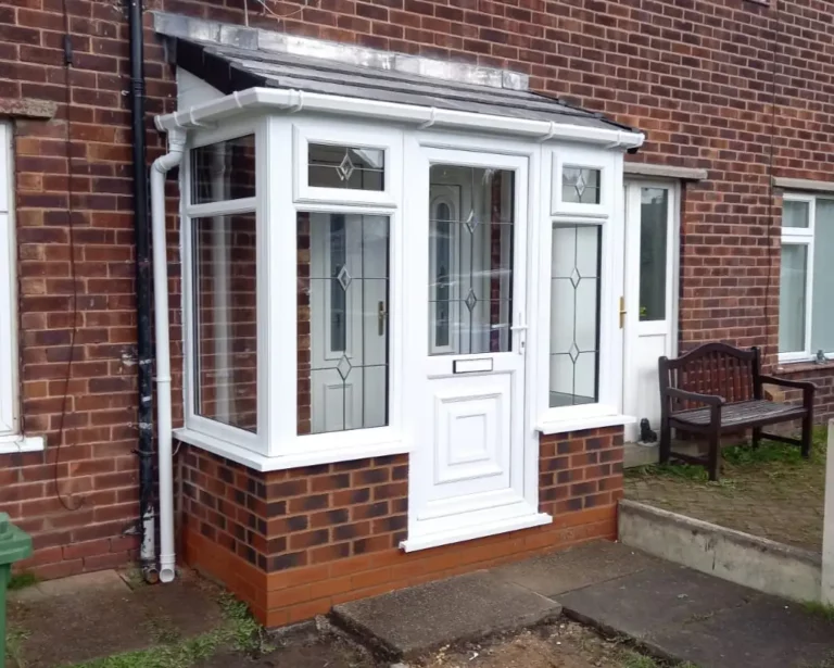
- Brick Tones – Red and orange brick pairs well with warm neutrals, cream, or dark green frames. Cool grey brick suits slate, charcoal, or white finishes more naturally.
- Roof Material – Clay roof tiles lean towards warmer colour pairings, while slate roofs complement cooler, darker frames. Matching the undertone of your roof to your window colour creates visual unity.
- Rendered Exteriors – Light render works with almost any frame colour. Darker render, such as charcoal or anthracite, pairs well with white or pale grey to maintain contrast and definition.
- Garden and Surroundings – Properties surrounded by greenery often benefit from natural or earthy frame colours. In denser urban settings, bolder or cleaner tones tend to read more clearly from the street.
Light vs Dark Colours for Your Home
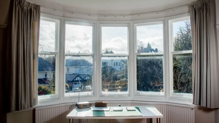
Both light and dark colour options offer distinct advantages depending on the property and the homeowner’s priorities. Light colours, such as white and cream, reflect sunlight and give a clean, open appearance to the exterior. They suit a wide range of property styles. Darker tones, including black and anthracite grey, create a bold, defined look and tend to show less surface dust. In terms of maintenance, both perform well when applied to quality uPVC profiles, which resist fading and require minimal upkeep over time.
Tips for Choosing the Perfect Colour
Taking time to test and plan before committing to a colour makes a noticeable difference to the final result. A colour that looks ideal on a screen can shift significantly once seen in natural light:
- Colour Samples – Request physical samples and hold them against your exterior in different lighting conditions. Morning light and overcast skies can change how a colour reads compared to direct afternoon sun.
- Sunlight Exposure – A north-facing front door receives very little direct light, which can make darker colours feel heavy. South-facing entrances handle bold colours well, as natural light brings out their depth.
- Long-Term Planning – Choose colours with broad, lasting appeal rather than short-lived trends. Classic and heritage tones retain their value and suit future buyers if the property is ever sold.
- Coordinating Frames and Doors – Window frames and doors do not need to match exactly, but they should share a common tone or undertone. A consistent colour family across all openings gives the exterior a cohesive finish.
Common Mistakes to Avoid
Colour decisions are easier to get right when you know where others have gone wrong. A few straightforward errors account for most exterior colour choices that look out of place or date quickly:
- Clashing Tones – Choosing a frame colour that fights against the brickwork or render creates visual tension. Always test colours alongside the fixed elements of the property before deciding.
- Short-Term Trends – Colours that feel fresh and exciting for a season can feel dated within a few years. Colours like lime, bright orange, or neon tones carry real risk for long-term colour clashes or resale value.
- Neighbourhood Context – A bold colour choice can work well, but it should still sit comfortably within the wider street. Consider the other styles in your local area first to see which blend well and which will stand out, especially if you want to look at design trends beyond simply matters of colour.
Make Your Colour Choice With Confidence
The right window and door colours can lift the entire appearance of a property, adding kerb appeal, character, and long-term value. Whether you are drawn to classic neutrals, heritage tones, or something bolder, the key is to choose colours that work with your home rather than against it. We proudly serve homeowners across Yorkshire, from Harrogate to Driffield, with bespoke windows and doors across a wide range of colours and finishes. Contact the Eliments team today for a free, no-obligation quote. We can provide trusted guidance on finding the right colours for your home.
No-Obligation
Quote